Why Campaign Website Design Matters for Remote Appointment Setters

Why Campaign Website Design Matters for Remote Appointment Setters
Think of it like this. You work hard to get a prospect on the phone. You find their pain points. You build trust. You get them interested in your offer.
Then you send them a link to a landing page.
What happens if that page takes too long to load? What if the headline does not match what you discussed? Or what if the sign up form asks for too much information?
They click away. The appointment is gone.
This is why understanding campaign website design is a critical skill for remote appointment setters today. A well built campaign website acts like a silent salesperson. It works for you around the clock to turn interest into booked calls.

By studying real campaign websites examples, you can learn exactly what drives results.
For example, recent research shows that simplifying your forms can increase conversions by up to 120%. Strong headlines can boost results by 27% to 104% (Lovable). Experts also agree that fast loading speeds and clear messaging are non negotiable in 2026 (Venture Harbour). In fact, following proven landing page design practices can take conversion rates from just 2% to over 10% (Clicks Geek).
Knowing these best practices helps you in two big ways.
First, you can spot weak spots in your own sales funnel. Second, you can give smart feedback to clients or your boss on how to capture more leads.
If you want to build a complete strategy around this, check out our guide on the user experience design process.
In this article, we share actionable tips and real campaign websites examples to help you close more deals in 2026.
Clear Value Proposition Above the Fold
You have about three seconds. That is how long most visitors decide whether to stay or leave. So what do they see first?
The area of a webpage visible before scrolling is called "above the fold." This space is prime real estate. And it needs one thing above all else. A clear value proposition.
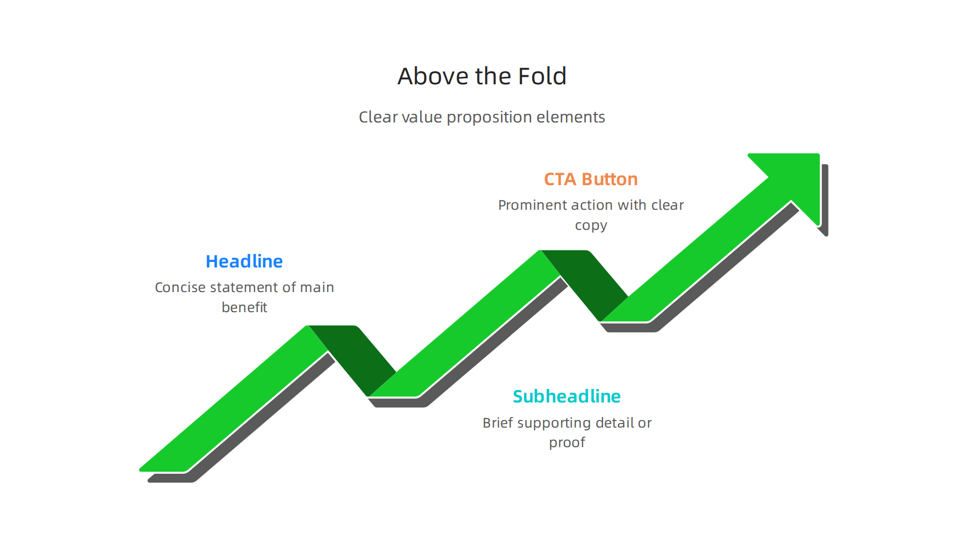
Your value proposition tells the visitor exactly what you offer and why it matters to them. It answers one simple question. "What is in it for me?"
Focus on benefits, not features.
Here is a common mistake. A campaign website might say "We use AI powered lead generation software." That is a feature. The visitor does not care about the software. They care about the result. A better version says "Book more qualified appointments in half the time."
See the difference? One describes what you use. The other describes what they get.
Top campaign websites examples prove this approach works. The best ones put the benefit front and center. They use a short, punchy headline. They add a supporting subheadline. And they include one clear action button.
Recent research shows that optimizing your page structure and focusing on clear messaging can help you move conversion rates from 2% to 10% or higher (Clicks Geek). Another key insight from experts is to "define conversion quality before editing anything" (Unicorn Platform). This means you need to know what a good result looks like before you change a single word on your page.
For remote appointment setters, understanding value proposition helps in two ways. First, you can check if the landing pages you send prospects actually communicate value. Second, you can suggest improvements to clients or your team.
If you want to build a strong foundation in sales skills that help you communicate value, check out our guide on the real sales definition every remote appointment setter needs.
The goal is simple. When someone lands on your page, they should know exactly what they get and why they should take action. No confusion. No guessing. Just clear, benefit driven messaging right at the top.
Compelling Headlines and Subheadlines
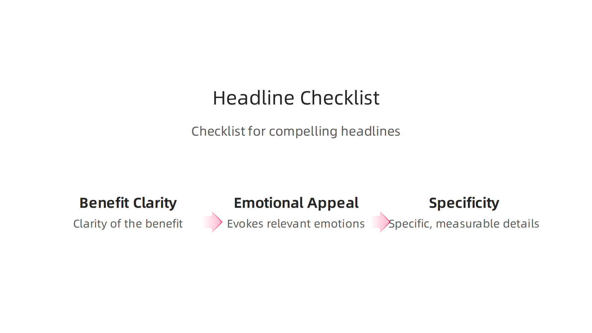
You got them to stop scrolling. Now you need to grab their attention in a split second. That is the job of your headline.
A headline is the first thing people read on your page. It must hook them instantly and tell them the main benefit they will get. Think of it as a promise you make to the visitor.
Here is a simple formula for a strong headline. State the result your audience wants most. "Book 10 More meetings Every Week Without Cold Calling." That headline works because it speaks directly to pain points remote appointment setters know well.
Your subheadline then backs up that promise. It adds more detail and addresses any doubts the reader might have. The best subheadlines dig into the "how" or "why" behind the headline promise.
Say your headline promises more meetings. Your subheadline could say "Use proven scripts and targeting strategies that top 1% appointment setters use daily." See how the subheadline adds credibility and reduces skepticism?
Here is the thing. Even small changes to headlines can make a big difference. Research shows that optimizing headline copy alone can boost conversions by 27% to 104% (Lovable). That is a massive lift from just tweaking a few words.
The best campaign websites examples treat headlines like living experiments. They do not guess what works. They test.
How to test your headlines like a pro:
- Write 5 to 10 headline variations for every page
- Run A/B tests to see which version gets more clicks or conversions
- Look at data from successful brands like VWO, Unbounce, and Booking.com for proven patterns (Venture Harbour)
- Test different emotional angles such as fear of missing out, desire for gain, or curiosity
Some marketers worry that A/B testing sounds complicated. It does not need to be. Many tools let you set up a test in minutes. The key is starting small and letting data guide your decisions.
For a remote appointment setter, strong headlines matter in two places. First, the landing pages you send to prospects. Second, any portfolio website you build to showcase your work. A clear headline can be the difference between a prospect booking a call or clicking away.
If you want to create pages that convert well, understanding the user experience design process step by step helps you build layouts that guide visitors naturally toward action. Headlines and subheadlines are just one piece of that puzzle, but they are often the most important piece.
Here is a quick checklist for your next headline:
| Element | What to check |
|———|—————|
| Benefit | Does it promise a clear result? |
| Clarity | Can someone understand it in 2 seconds? |
| Emotion | Does it tap into a desire or fear? |
| Specificity | Does it include numbers or timeframes? |
Keep your headlines short. Aim for 8 to 12 words maximum. Use power words that trigger emotion. And always pair every headline with a subheadline that adds supporting detail.
Your value proposition tells them what you offer. Your headline and subheadline make them care enough to keep reading. Get both right, and you turn curious visitors into engaged prospects ready to take action.
High-Impact Visuals and Multimedia
Your headline got them to stop and read. Now you need to keep them on the page. That is where visuals come in. Images and videos can boost engagement and make people stay much longer.
Here is the thing. A strong visual tells a story faster than words ever can. For remote appointment setters, this matters a lot. When you show a screenshot of your CRM dashboard or a short video of your prospecting process, prospects see proof you can do the job. That builds trust instantly.
Relevant visuals beat stock photos every time.
Generic stock photos of people smiling at laptops feel fake. Real screenshots, short screen recordings, or photos of your actual workspace connect better. They show you are a real person who does real work. This is one reason top campaign websites examples use authentic images instead of polished stock shots.
But visuals only help if they load fast. A slow page kills conversions. Research shows that optimized page speed can directly improve conversion rates, and using smaller file formats like WebP makes a big difference (Clicks Geek). If you use a Wix website builder or Google Sites templates for your portfolio, check the image size before uploading. Compress everything.
Quick tips for high-impact visuals:
| What to do | Why it matters |
|————|—————-|
| Use real screenshots or videos | Shows authenticity and skill |
| Keep file sizes small | Prevents slow loading |
| Add captions or context | Helps viewers understand what they see |
| Place visuals near related text | Creates a clear message flow |
A short video explaining how you book appointments can be powerful. You do not need fancy equipment. A clear screen recording with your voice explaining the steps works great.
If you are building your first portfolio website, this guide on how to become a remote appointment setter in 2026 covers the skills you should highlight. Pairing that knowledge with strong visuals will make your page stand out.
Remember: every image or video on your page should serve a purpose. If it does not support your message or build trust, leave it out. Keep it real, keep it fast, and keep it relevant.
Streamlined Navigation and Focus
You have great visuals on your page. Your headline grabs attention. But if your navigation is a mess, you lose people. Here is the simple truth: every extra link on your menu gives your visitor another reason to leave.
Think about it. A prospect arrives at your page. They see a menu with five, six, or seven options. What happens next? They start browsing instead of taking the action you want. They click on a blog post, then another, and never come back to contact you.
Minimize the choices you give people.
The best campaign websites examples have one thing in common: they guide visitors toward one clear goal. Nothing distracts from that path. When you build your portfolio website, strip away every link that does not directly support your primary call to action.
This principle is backed by real data. Landing page experts have found that reducing form fields can deliver a 120% lift in conversions (Lovable). The same logic applies to navigation. Every menu item you remove is one less distraction. One less reason for someone to click away.
The one action rule.
Every page on your portfolio should have a single purpose. Do you want someone to book a call? Download your resume? Watch a demo? Pick one. Only one.
When you build your page using a Wix website builder or Google Sites templates, keep this rule front and center. Do not add a "Services" page link and a "Blog" link and a "About Us" link. Instead, use one prominent button that says "Schedule a Discovery Call" or "Hire Me Today." That is it.
A clear path from landing to CTA reduces friction (Venture Harbour). Friction is anything that makes a visitor stop and think. A busy navigation bar is friction. A confusing layout is friction. Your job is to remove it all.
Practical ways to streamline your navigation:
- Put only essential links in your top menu
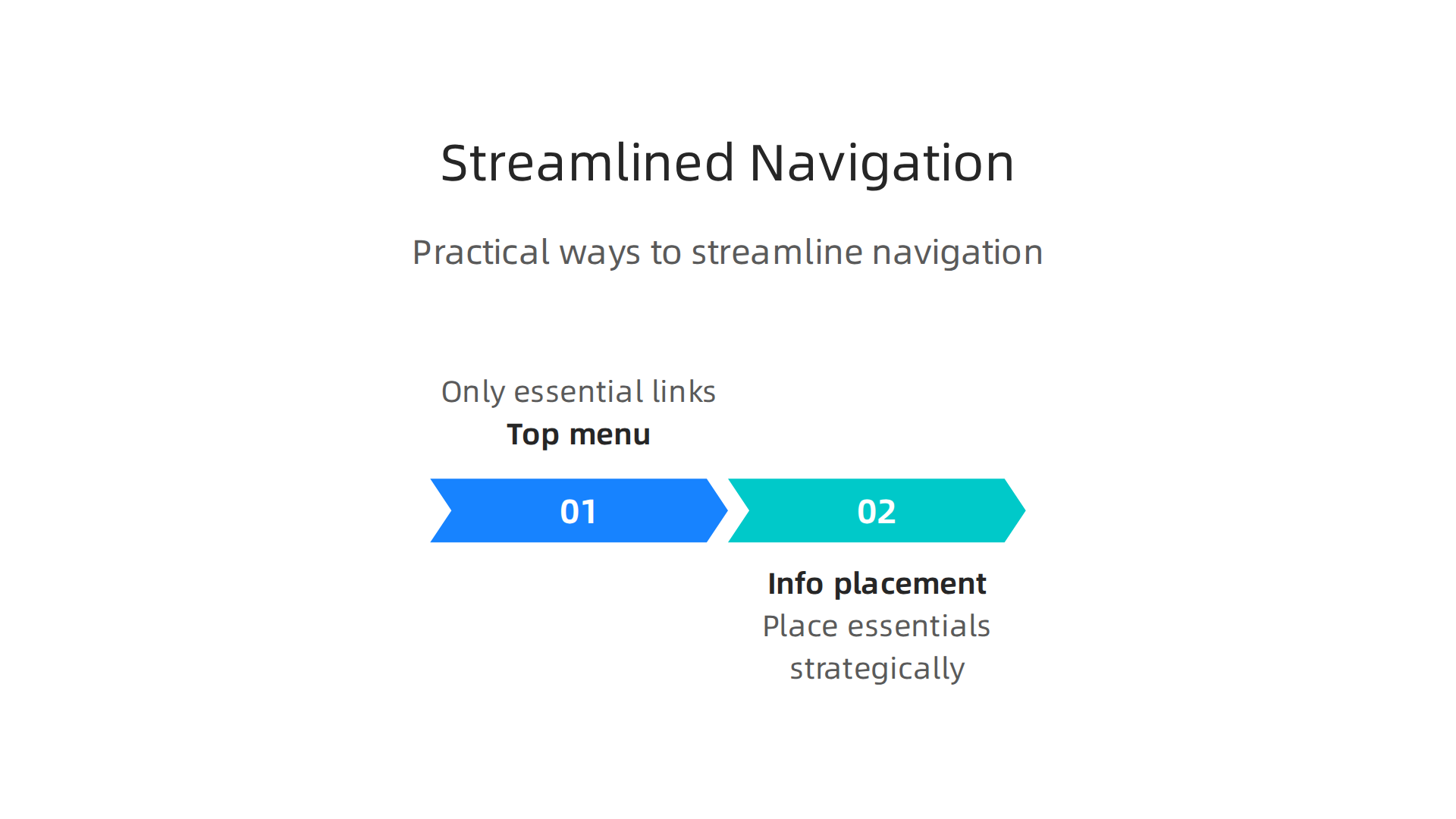
- Move less important pages to the footer
- Use one primary button color that stands out
- Remove dropdown menus that hide choices
- Test your page on mobile to ensure it stays simple
If you are just starting out, learning how to become a remote appointment setter in 2026 can help you understand what prospects really care about. Once you know that, you can design your page to serve that single need.
Remember this: a confused mind says no. A focused mind says yes. Keep your navigation clean, your page simple, and your message clear. That is how you turn visitors into booked appointments.
Social Proof and Trust Signals
You simplified your navigation. Your page looks clean. But your visitor still might not click that big CTA button. Why? Because they don’t fully trust you yet. They are thinking: "Is this person real? Have they actually helped anyone? Will I get results too?"
That hesitation is normal. The fix is social proof. Social proof means showing other people have used your service and loved it. When a prospect sees proof, their brain relaxes. They think, "Okay, other people did this. It worked for them. It might work for me too."
What social proof should you add?
The best campaign websites examples all include these trust builders:
- Testimonials from real clients – A short quote with a name and photo works wonders.
- Case studies – A one paragraph story about how you solved a problem for a specific client.
- Client logos – Even a few well-known logos show you are credible.
- Trust badges – Security seals, industry certifications, or membership badges reduce anxiety.
Place your strongest proof above the fold, right where the eye goes first (Uforocks). Then put more proof near your call to action. That is the moment when doubt peaks, so that is where you need trust most.
Social proof on landing pages means displaying authentic customer feedback testimonials, ratings, case studies close to your button (Provesrc). It is a simple move that can lift conversions dramatically.
Trust signals are not optional in 2026.
Whether you build your portfolio website with google sites templates or a wix website builder, you must include trust elements. They are what separate an amateur page from a professional one. Trust signals reduce user anxiety about taking a risk (Sugarpixels).
If you are just starting out in remote sales, learning how to become a remote appointment setter in 2026 will also teach you that trust is your biggest asset. Once you build a page that shows proof, people stop wondering and start booking.
Here is a quick checklist for your own page:
- Add at least one testimonial near your main button
- Include a client logo if you have worked with any known brand
- Add a security badge if you collect any personal information
- Keep all proof authentic. No fake reviews ever.
People do not buy from strangers. They buy from people they trust. Your social proof is your handshake. Make it strong and put it where it counts.
Optimized Call-to-Action Buttons
So you have built trust with social proof. Great. Now your visitor feels ready to act. They look at your button. Then they pause. Or worse, they leave.
Here is the thing. If your button does not look clickable or the words feel weak, all your hard work disappears. Your call to action is the final push. It needs to be perfect.
What makes a button work in 2026?
First, the button must stand out. Use a color that pops against your page. Do not let it blend in.

If you are using google sites templates or a wix website builder, check the button style carefully. It needs to say "click me" without words.
Second, the copy matters more than anything. "Submit" is a lazy button. Instead, use action words that promise a benefit. "Get Your Free Session Now" works because it gives urgency and value. It tells the user exactly what happens next.
Third, placement is critical. Put your strongest button where eyes naturally land. Then repeat it near the bottom after people have read your pitch. Effective landing page design relies heavily on this strategy (Leadfeeder). Placing your CTA strategically after presenting your value proposition and social proof maximizes its impact (Landingpageflow).
Do not guess. Test.
The best campaign websites examples all have one thing in common. The owners tested their buttons. They changed colors. They rewrote copy. They moved buttons around. Then they kept what worked. A/B testing your CTA is a quick way to boost conversions (Salespanel). Even small changes can lead to more booked calls.
If you want people to actually click, your button must feel like the easiest and most rewarding next step. Pair a strong button with a smooth process. Understanding the user experience design process will help you connect the click to a great outcome.
Once your CTA is dialed in, you are ready to drive serious traffic and start earning. Learn how to make money online in 2026 with a complete remote sales system.
Mobile-First Design
You have a strong button and great social proof. But here is a hard truth. Most people will see your site on a phone, not a computer. If your page looks bad on a small screen, they will swipe away before ever reading a word.

This matters a lot for remote job seekers. You are often on your phone checking leads, applying for roles, or sending follow ups. Your visitors are doing the same thing. They want a smooth experience from their pocket. That is why the best campaign websites examples in 2026 are built for mobile first, not as an afterthought.
What does mobile first actually mean?
It means you start designing for the smallest screen and then add extras for bigger ones. Everything needs to work with a thumb. Buttons must be big enough to tap without zooming. Text should be readable without pinching. Navigation must be simple.
If you are using google sites templates or a wix website builder, double check how your site looks on a phone. Many builders say they are responsive, but you still need to verify. That beautiful desktop layout might turn into a mess on mobile.
Speed is everything on mobile
Page speed matters more than ever in 2026. Slow loading pages frustrate users and hurt conversions (OAK Interactive). In fact, faster pages generate more revenue and rank higher in search results (Digital Applied). One ecommerce platform saw a 7% boost in conversions just by cutting load time from 3 seconds to 1.5 seconds (Zigpoll). That is real money left on the table if your site is slow.
How do you speed things up? Compress images. Remove unnecessary plugins. Use a simple design that loads fast. Your portfolio website or landing page does not need fancy animations that take 5 seconds to load.
Test on real devices
Do not just look at your site on a desktop browser. Grab your actual phone. Walk through the full experience. Is everything tappable? Does the form work? Does the page load before your visitor gets bored? Testing across multiple devices ensures a seamless experience for everyone (SEO Sherpa).
Think about the user experience design process from the visitor’s perspective. They should never struggle to find what they need. Every tap should feel natural.
When your site works great on mobile, you keep people engaged longer. That means more booked calls and more commissions. Ready to build a mobile friendly site that actually converts? Start by auditing your current design and making speed your top priority.
Fast Loading Speeds
Mobile first is smart. But here is the hard truth. A mobile friendly layout does not help if it takes forever to load. In 2026, speed is everything. If your site is slow, people leave. And they do not come back.
Speed kills or makes your conversion rate
We have all been there. You tap a link and wait. And wait. And then you swipe away. Your visitors do the same thing. Page speed directly impacts bounce rate and conversion. The data is clear. Faster pages generate more revenue and rank better in search results (Digital Applied). One ecommerce platform boosted conversions by 7% just by cutting load time from 3 seconds to 1.5 seconds (Zigpoll). That is real money.
Core Web Vitals matter in 2026
Google now tracks Core Web Vitals. These are simple metrics that measure your site speed and stability.

They look at how fast the main content shows up. They check if your site responds quickly to taps. And they measure if things jump around while loading. These vitals affect your SEO ranking and how much people trust your site (Monetate). You need to pay attention to them.
Simple ways to speed up your site
You do not need to be a tech expert to make things faster. Start with images. Compress them using a free tool before you upload. Turn on browser caching. This stores parts of your site on the visitor’s phone so it loads faster next time. And get rid of any plugins or scripts you do not absolutely need. A simple design is often a fast design.
Whether you are using google sites templates, a wix website builder, or building a custom portfolio website, speed is non-negotiable. Always test your site on a real phone (SEO Sherpa).
Think of speed as part of the overall user experience design process . When your site loads fast, people stay longer. They trust you more. And they are more likely to book that appointment. Do not let a slow server ruin a great campaign. Speed up your site and watch your results improve.
Persuasive Copywriting
A fast site gets people in the door. But your words decide if they stay and take action. In 2026, persuasive copywriting turns visitors into leads. It is not about fancy language. It is about speaking directly to what your reader needs and feels.
Write benefits, not features
Your copy must focus on what your offer does for the reader. Do not just list what you provide. Show how it solves their problem. This is called benefit-driven copy. When you study campaign websites examples, notice how the best ones use headlines that speak to pain points. They say things like "Stop losing leads" instead of "We offer CRM software." That small shift changes everything (Venture Harbour).
Storytelling builds trust
People remember stories more than facts. A short story about a customer who struggled and found success creates emotional connection. Your reader thinks, "That could be me." This trust is critical for getting someone to hand over their email or book a call. Use a simple story that shows you understand their world.
Try a proven framework
Copywriting formulas give you a clear structure. One of the most effective for landing pages is AIDA (Attention, Interest, Desire, Action).
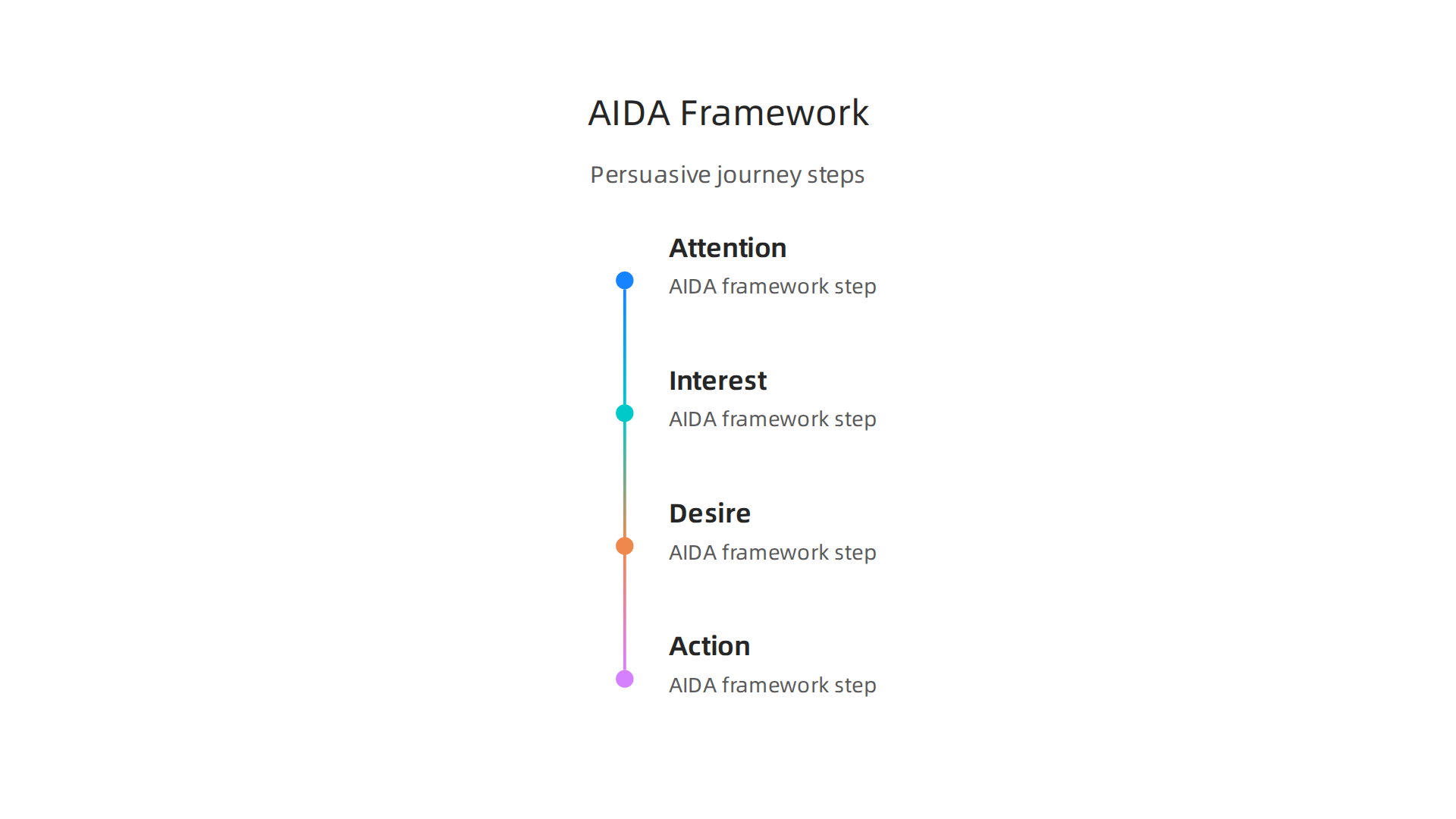
You grab attention with a strong headline. You build interest by showing you understand the problem. You create desire by painting a picture of the solution. Then you ask for action with a clear call to button (ThriveThemes). It works because it follows how people naturally decide.
Apply this to your campaign
Whether you build with google sites templates or a wix website builder, the copy is what converts. Think of your campaign page as a portfolio website for your offer. Every word should pull the reader toward that one action you want them to take.
To master persuasion in your writing, check out this guide to the real sales definition every remote appointment setter needs. It helps you understand what truly drives a buying decision.
A/B Testing and Iteration
You put together strong persuasive copy. You used benefit driven headlines and storytelling. But here is the hard truth: your first version is rarely your best version. That is where A/B testing comes in.
A/B testing means showing two versions of your page to different visitors to see which one performs better. It is not complicated. You change one thing at a time. Then you let real people decide.

Start with what matters most
The two highest impact elements on any page are your headline and your call to action. A small change in your headline can lift conversions by double digits. When you study successful campaign websites examples, you will notice many of them run constant tests on these two pieces. They do not guess what works. They let the data tell them.
Focus on one change per test. Try a different CTA button color. Rewrite your headline to speak to a different pain point. Then wait until you have enough traffic to reach statistical significance. Without enough data, you might make a change based on luck, not truth. Following landing page best practices from 2026 helps you know what to prioritize in your tests.
Iteration turns good into great
Testing is not a one time event. It is a cycle. You run a test, learn something, make a change, and test again. Over time, these small gains add up. A 5% lift in conversion here, a 10% lift there. That is how top pages become top pages.
Whether you build with google sites templates or a wix website builder, your portfolio website or campaign page should never stop evolving. The best campaign websites examples are constantly refined based on real visitor behavior.
If you want to sharpen your overall sales approach while you test, check out this guide on how to use business administration skills to become a better remote appointment setter. It gives you practical frameworks for making smarter decisions in your work.
Remember: you do not need to test everything at once. Pick one thing. Run a clean test. Let the numbers tell you what to do next.
So what should you look for when you run those tests? Real world campaign websites examples give you a clear target to aim for. Let’s break down a few high converting pages and the specific design and copy choices that made them work.
1. The focused SaaS landing page
One top performing SaaS website does not try to sell everything at once. It highlights a single benefit above the fold. The headline speaks to one clear pain point. The design stays clean with just one CTA button. A roundup of best SaaS landing pages in 2026 shows that removing extra menu links and clutter boosts conversion significantly. The lesson here is simple: clarity beats creativity every time.
2. The streamlined ad campaign page
Another strong example comes from a targeted ad campaign. This page strips away everything that does not help you convert. No navigation bar. No footer links. Just a headline, a short video, and a form. The signup process flows so smoothly that visitors have no choice but to engage. Looking at high converting ad campaigns examples shows that reducing the number of actions a visitor can take directly increases the chance they take your desired one.
3. The trust heavy high converting website
One of the best high converting websites of 2026 combines social proof right next to the CTA. Instead of hiding testimonials at the bottom, it places a powerful customer quote right next to the signup button. This builds trust exactly when a visitor hesitates. The result is a significant lift in conversions without changing any other part of the page.
What you can learn from these examples
All three of these campaign websites examples share the same DNA. They are fast, clear, and focused on a single goal. Whether you are building a portfolio website or a product launch page, you can apply these patterns today. You can even start with google sites templates or a wix website builder to get the structure right fast.
But the real skill is understanding why these layouts work. If you want to go deeper into how visitors think and move through a page, our guide on the user experience design process step by step teaches you the psychology behind high converting designs.
Summary
This article explains why campaign website design is essential for remote appointment setters and shows practical ways to turn visits into booked calls. It covers high-impact elements—clear value propositions above the fold, persuasive headlines, authentic visuals, simplified navigation, social proof, strong CTAs, mobile-first layouts, and fast loading speeds—and explains how each choice affects conversions. You’ll see why benefit-driven copy and focused page structure keep prospects from clicking away, and how small changes (headline tweaks, fewer form fields, better images) can boost results dramatically. The guide also stresses testing and iteration so you can move from guesswork to data-driven improvements. After reading, you’ll be able to audit landing pages, suggest concrete fixes to clients or employers, and prioritize tests that drive more booked appointments.
More articles